

Revenue Chart
The chart at the top of the Home page plots your revenue over time. By default it shows the last 6 months, with a tooltip on hover showing the exact figure for any given date. Use the Last 6 months dropdown to change the time window. The chart updates immediately.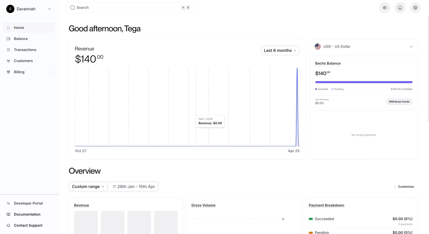
Bachs Balance
On the right side of the Home page, your current balance is displayed alongside a breakdown of what’s available versus pending.
Click Withdraw funds to initiate a withdrawal from your available balance.
Overview
Below the revenue chart, the Overview section is a grid of metric cards giving you a broader picture of account activity over a selected date range.
Date Range
Use the Custom range picker to set a start and end date. The entire overview grid updates to reflect that window. Unlike the revenue chart, the overview supports arbitrary date ranges, not only preset periods.Metric Cards
The default overview includes the following cards: Revenue Monthly revenue bars for the selected period. Each bar represents one month’s collected amount. Gross Volume Total payment volume processed: all charges regardless of outcome, including failed and refunded charges. This differs from revenue, which reflects only settled amounts. Payment Breakdown A summary of charges split by outcome for the selected period:
Net Volume Gross volume minus refunds and fees. This is the closest approximation of actual earnings for the period.
New Customers Count of unique customer records created within the selected range, i.e. first-time payers.
Latest Payment The most recent charge on your account, shown with amount and status. Useful for confirming a payment came through without navigating to Transactions.
Payments A chart or count of total payment events for the period, across all statuses.
Customizing the Overview
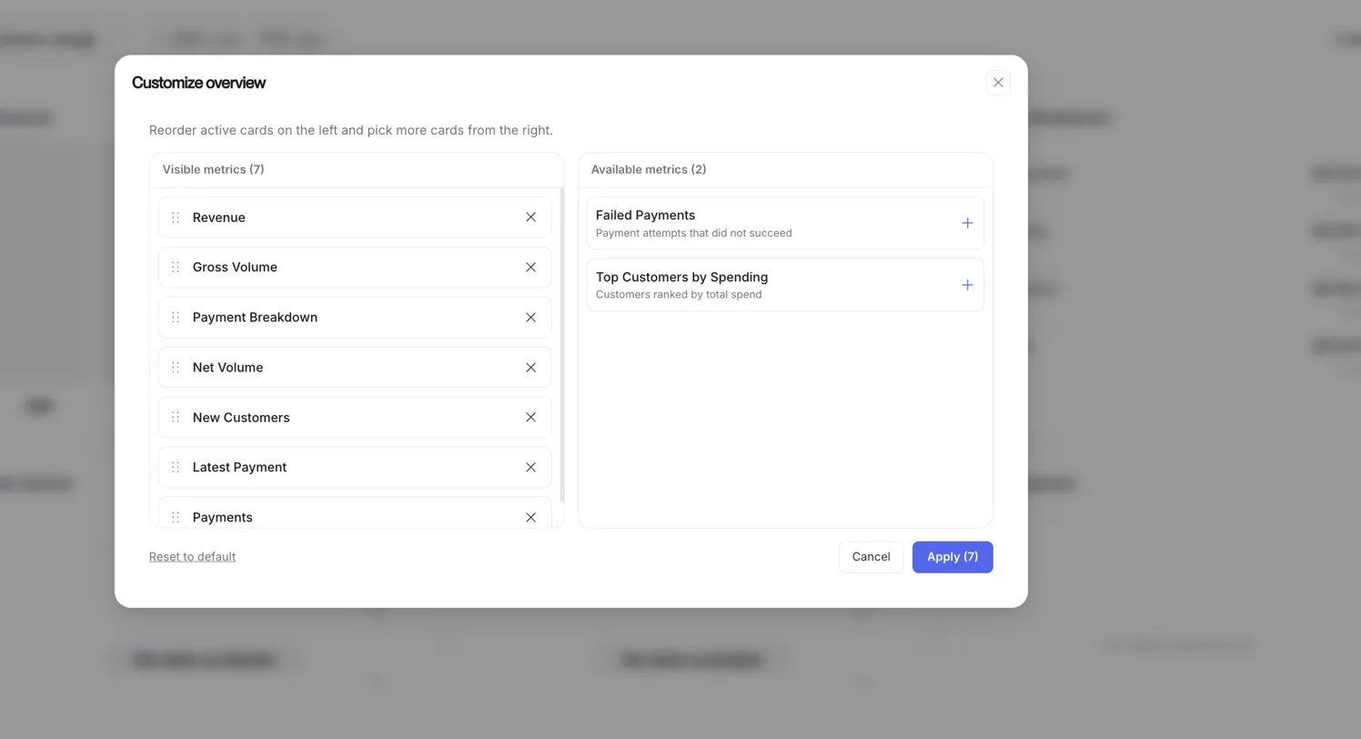
- Visible metrics: cards currently shown on your overview, in display order. Drag to reorder. Click × to remove a card.
- Available metrics: cards not currently shown. Click + to add them.
Available metrics to add
Once you’ve arranged your visible metrics, click Apply to save. The number in the Apply button reflects how many cards are currently active.
To revert to the original layout, click Reset to default at the bottom left of the panel.
Your overview layout is saved per account. Changes persist across sessions and are not affected by date range or filter selections.
Related
Transactions
The full log of every charge attempt on your account.
Customers
View customer records, payment history, and manage subscriptions.